Hello friends!
Becky here to show you the steps to how I put my Road Trip Selfie layout together.
I started off with a base of Kraft cardstock and then layered the diagonal rainbow stripe, the wood grain, the clouds and the pink scalloped papers. I made sure to use a piece of the woodgrain paper that had a diagonal that was the opposite of the diagonal on the rainbow stripe.
On top of that I placed a mat of the red heart paper and tucked one of the clear frames just under the right side. I adhered the clear frame with adhesives under where the yellow frame is so that you can't see it.
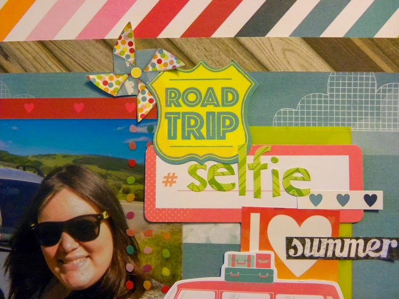
Next I stuck my photo down and attached another fun clear overlay on top of it to get the cute dots down the right side of the photo. I used small glue dots underneath some of the colored dots on the clear overlay so that it would stay stuck over the photo but you wouldn't see the glue.
Here's a close up of that...can you see where I glued it on?
Next I layered the word 'selfie' using letter stickers from the kit on top of the peach hashtag diecut and attached it so it overlaped the photo and the yellow frame. I layered the I {heart} summer sticker next and then cut a three blue hearts from the rainbow heart border sticker and layered it over the other items.
The 'ROAD TRIP' diecut and the awesome bus diecut went on next. I don't know how well you can read it in the photo but the bus says 'road trip' on the door. I attached the bus so that it covered up the word summer on the I {heart} summer sticker because I wanted to add another layer there...you'll see that in a minute.
Below the bus I fussy cut the banner from a piece of patterned paper and tucked it under the wheels of the bus. I also fussy cut out the other road trip sign from a piece of patterned paper and tucked that under as well.
As an after thought I realized that I needed a little something more at the top of my cluster of embellishments and so I cut the windmill sticker out and attached it so it was sticking out from the road trip sign. I put some baby powder on the points of windmill so that they would not stick to the page and bent them up to give it a little dimension rather than being a flat sticker.
And remember how I covered up the word 'summer' before? Well I replaced it with another word summer that I fussy cut from the chalkboard paper.
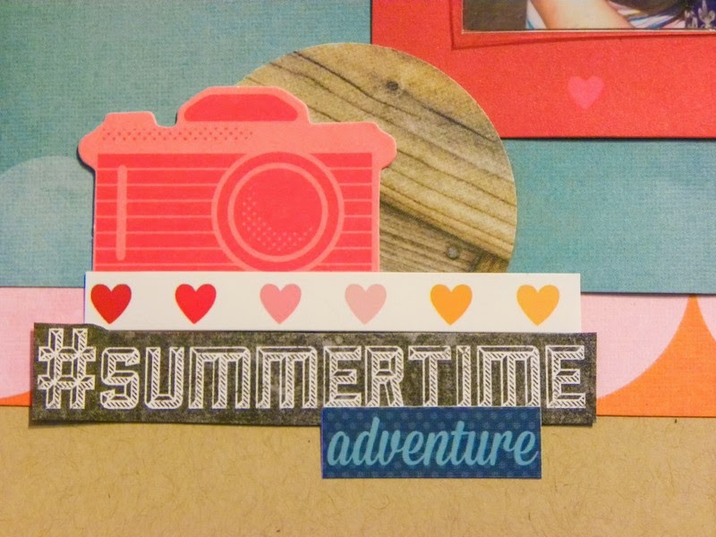
To anchor the page and create some balance I added another little cluster of embellishments to the bottom left corner of my photo. I used the camera diecut, layered on top of a circle I punched out of the woodgrain paper. I then layered some more of the rainbow heart border sticker with the word #summertime that I fussy cut out of the chalkboard paper, and finally a little word sticker.
So there you have it...my completed layout. I added a little journaling below the pink scalloped paper and it is complete!
I hope you enjoyed watching how I put this layout together. I'd love to see what you create with your Creative Kit this month! Make sure to share your projects on our FB page.
You can see more of Becky's beautiful work in our Design Team Gallery!
Here's the August Creative Kit:
We invite you to join us and experience the possibilities that our coordinated monthly kits offer. To purchase a kit, please visit our website, here.


2 comments:
Becky I loooove this tutorial :) fun, colourful and cute xx
Lovely tutorial, thank you
Post a Comment