Hi!
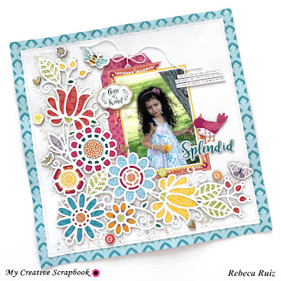
Hope you are having a great day! Do you love using flowers and cut files in your layouts? I surely do, and when I'm able to add a bit of mixed media to the page I enjoy it more. In this layout titled "Splendid" I used all those elements that I enjoy playing with and added a few extra things to give this page lots of texture and dimension. The result is a gorgeous page that captures the viewer’s attention and can be accomplished with less effort! Stay with me during this post to learn how I made this layout and check the process video at the end.

To create this layout, I used the May 2022 Main Kit of My Creative Scrapbook which features Paige Evans’ Splendid collection. I love this kit; the colors and designs of the papers and the embellishments are beautiful, and you can create many different projects because it is so versatile. I started this layout by cutting this beautiful cut file designed by Paige Evans that you can find in the My Creative Scrapbook files gallery when you subscribe to their monthly kit.

Then, I cut apart the paper with the 3" x 3" squares an
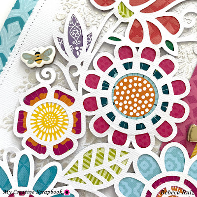
d used the flowers in the squares to back the centers of the cut file flowers. In the photos below, you can take a closer look on how they look. Before backing the file, I used an X-Acto knife to cut around the frame in the square. I saved them for future projects.


Once the centers of the flowers were backed, I started backing the rest of the design using the 3" x 3" squares’ B side (the one that doesn't have a frame).

This is how the whole cut file looks after being backed with patterned paper, but before I add it to the layout, I cut a 1" frame out of the blue paper and covered it with an 11" x 11" white cardstock. I stitched them together using white thread.
Then, I did a bit of mixed media using a floral stencil by Paige Evans and an iridescent paste by Vicki Boutin. I added it in the cut file area, letting it be seen in between the file and around the edges. When the paste was dry, I added the backed cut file using foam tape.

Since the layout is already busy and I want my photo to be seen, I used a 3 1/2" x 5 1/4" photo matted with a white and yellow border around it. Then, enhanced it with a tag cut from one of the papers and a piece of white thread to make a bow. Also, used one of the frames cut from the 3" x 3" square. I cut it in half and used it in two corners of the photo.

For the title I used the "Splendid" word from the title pack and embellished the layout using chipboard pieces and a bird I fussy cut from one of the papers. Some of the elements were added with foam tape and others with liquid glue.

If you want to see me creating this layout, check the process video.
Thanks for your visit and for staying with me during this post. I hope you like and enjoy this layout as much as I do, and it inspires you to craft. Don't forget to like the video and subscribe to my channel for more inspiration!


No comments:
Post a Comment