Here's Nicole...
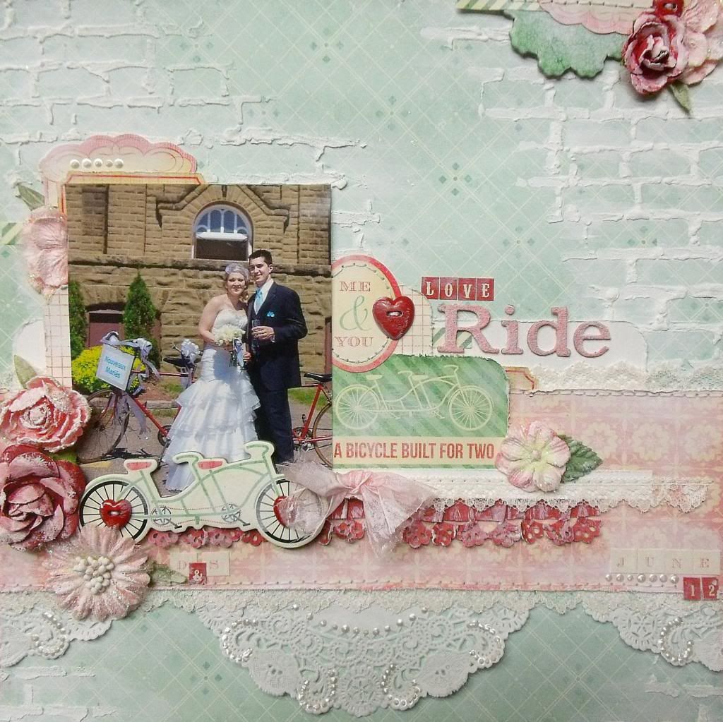
You might have noticed that my 'Love Ride' layout looks a bit distressed. I wanted a more elegant and shabby chic look for this wedding page. I am not a pro at mixed media, but I enjoy trying different techniques and learning along the way.
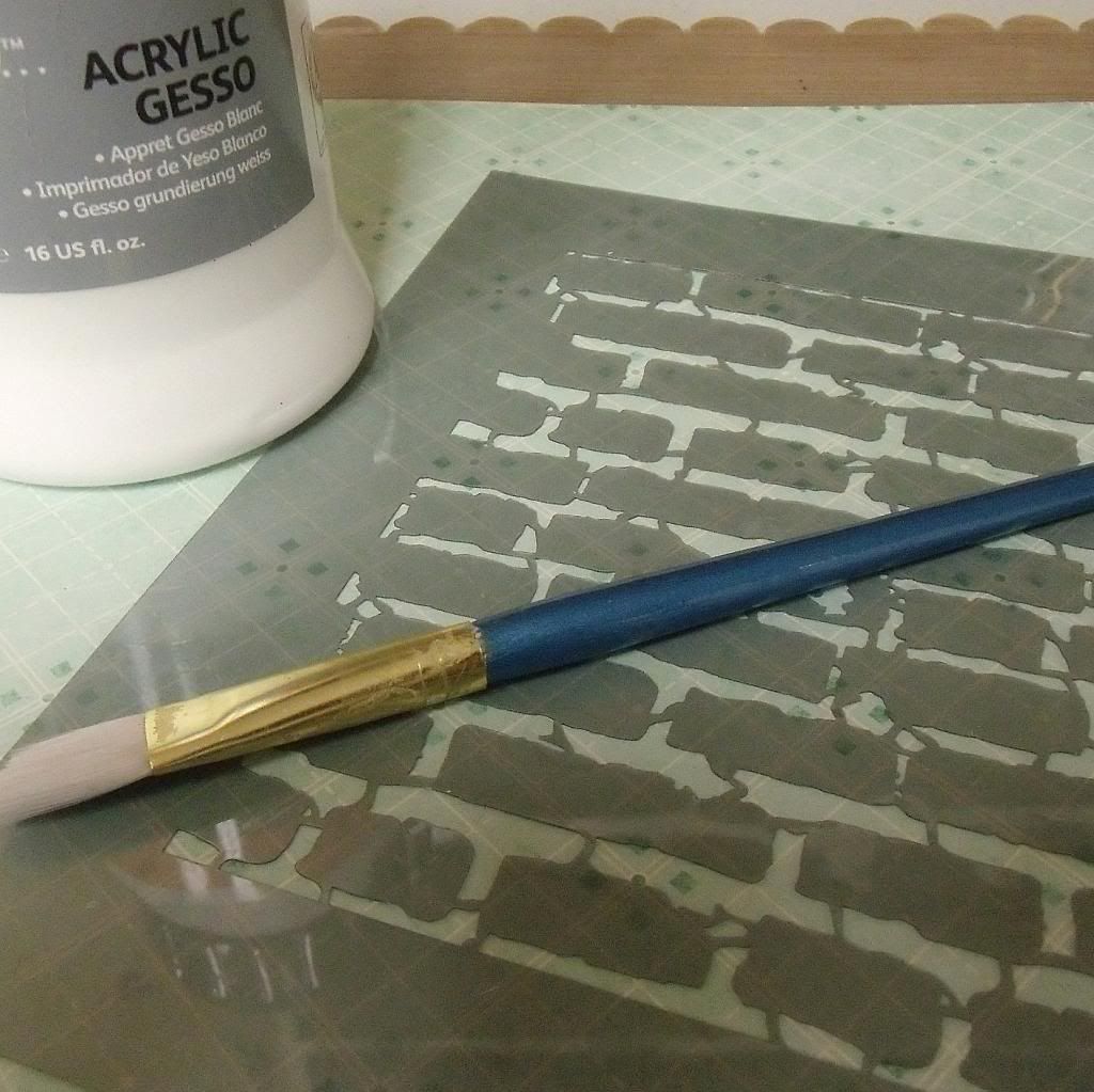
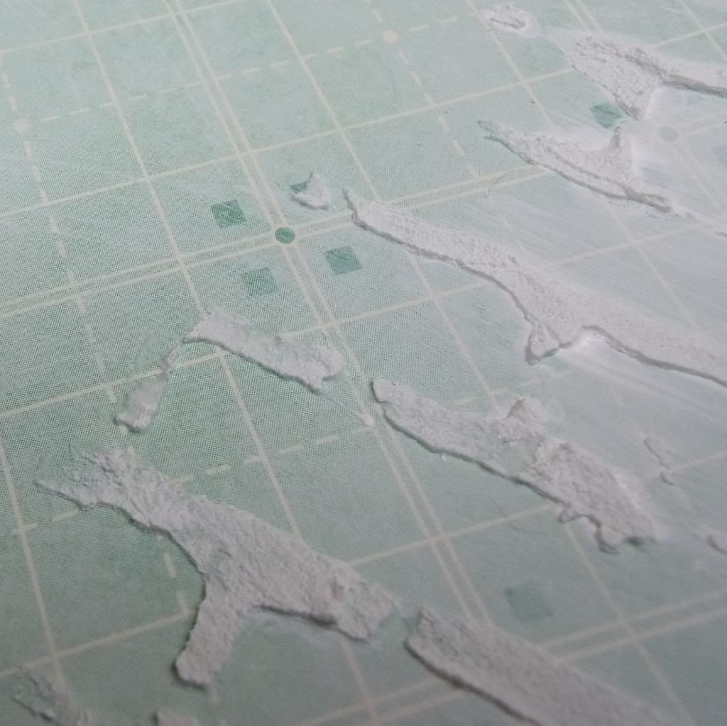
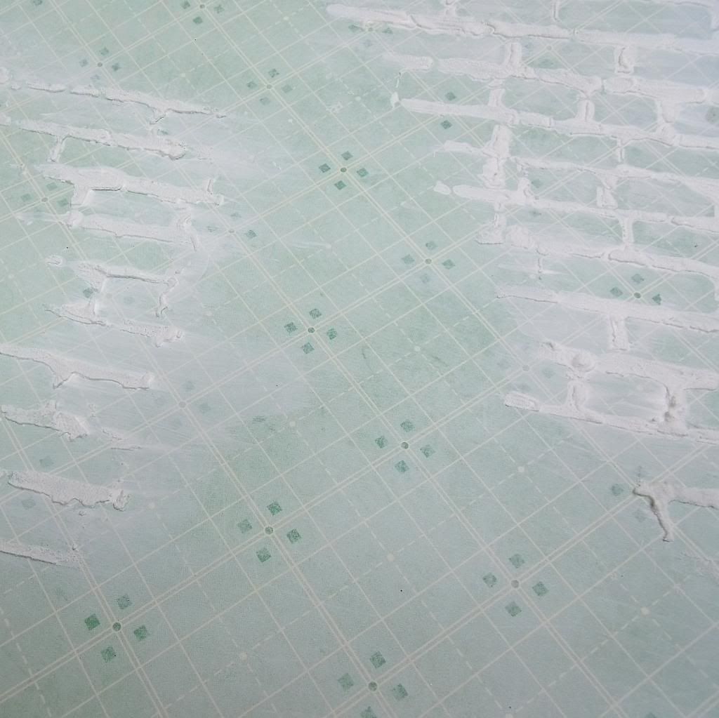
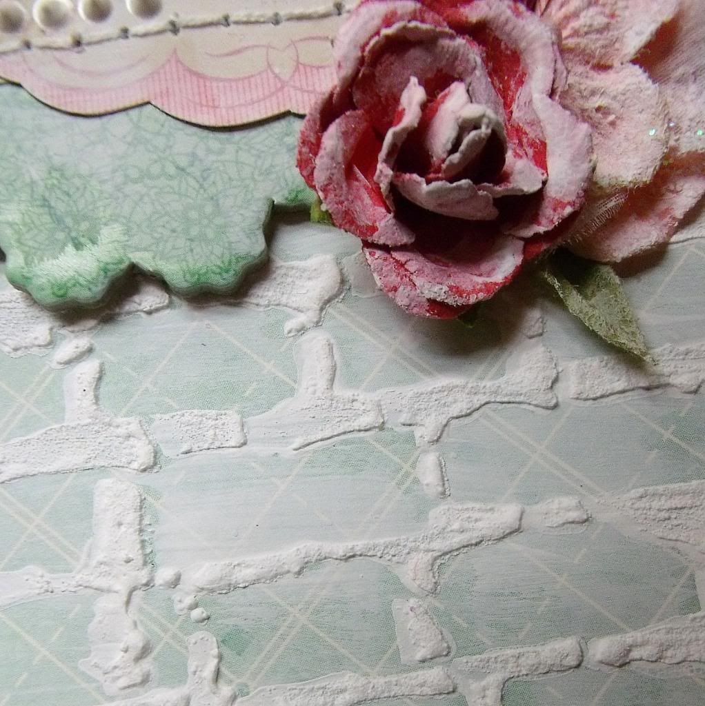
First I wanted to add a bit of texture to the background so I used a brick wall stencil and some white gesso.
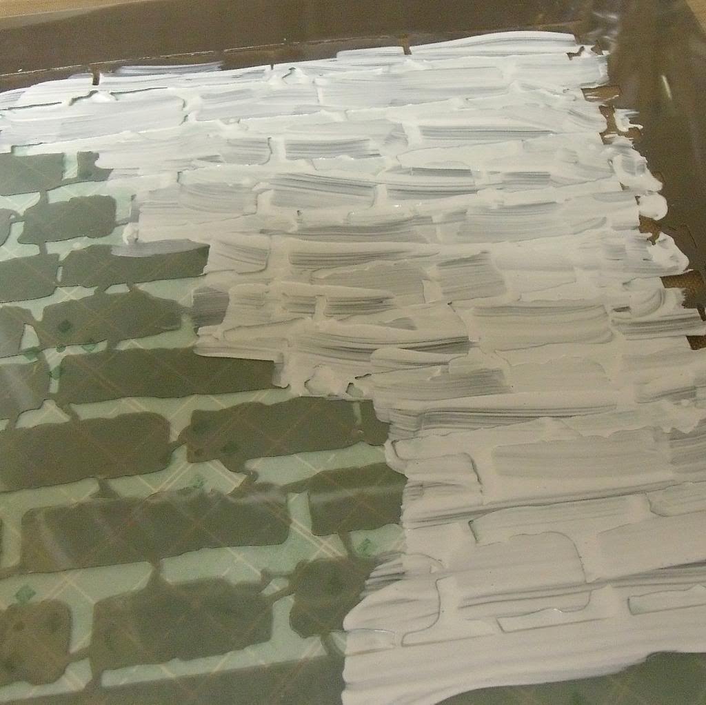
I carefully lined up the stencil where I wanted it and then put a fairly thick coat of gesso over it.
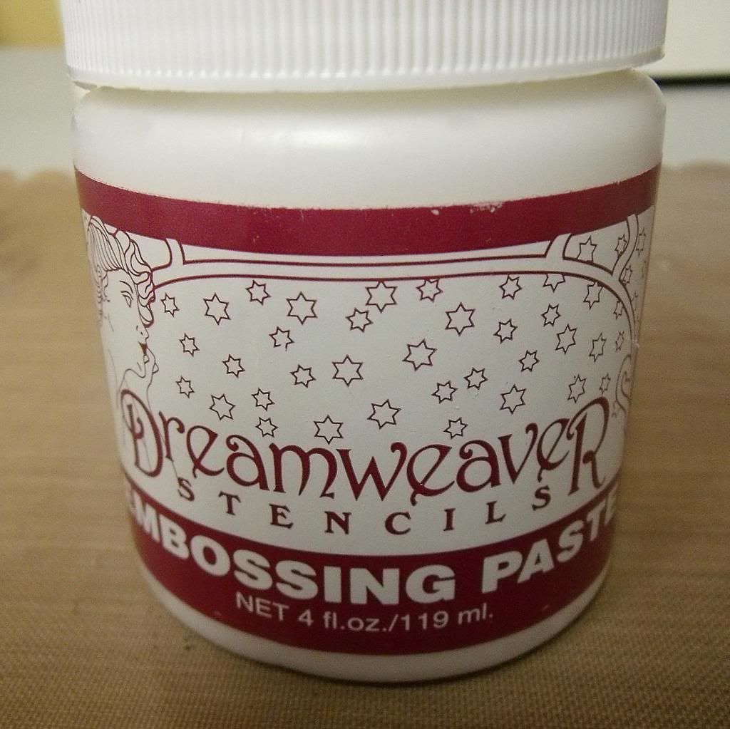
I then added some embossing paste.
Carefully removing the stencil, I then pulled out the heat gun and make the gesso and paste set to the paper.
I lightly brushed some gesso over the entire background, giving it a whitewashed effect.
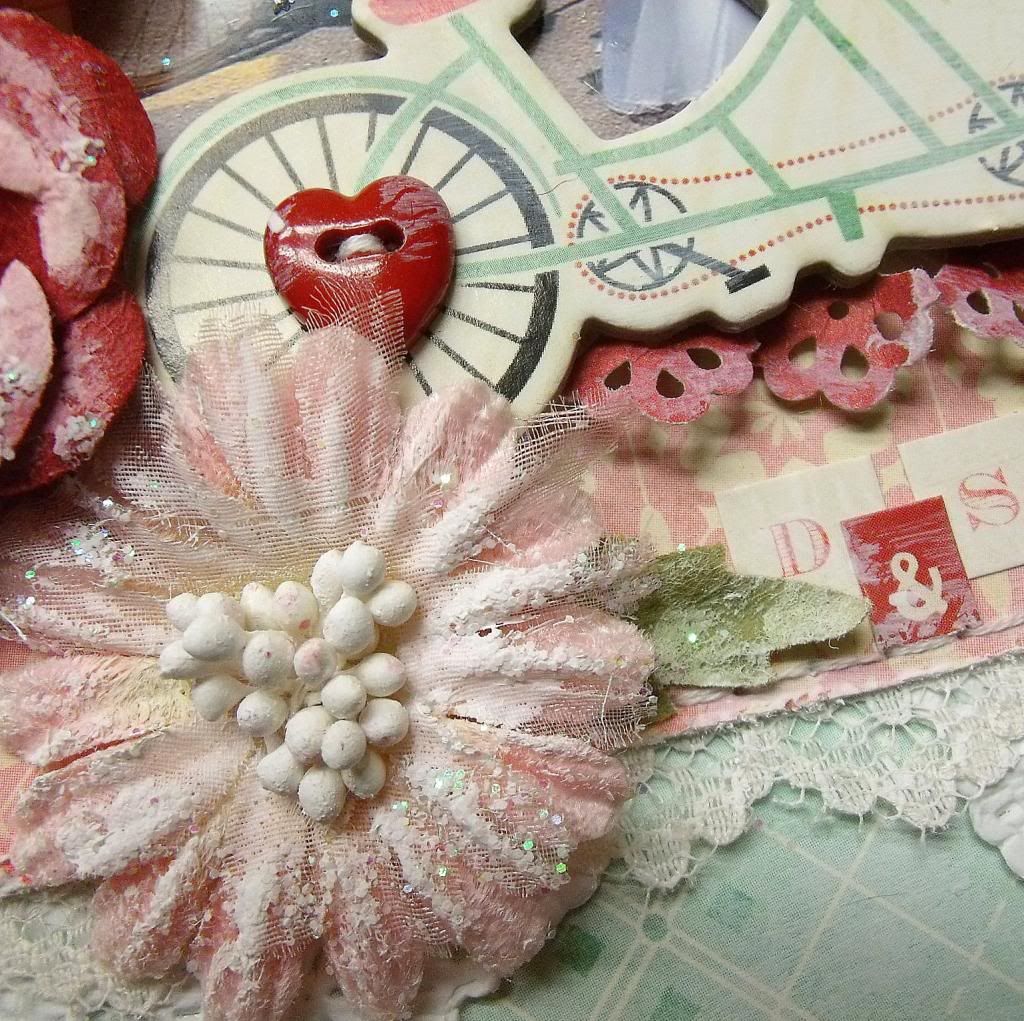
After my layout was finished, with embellishments in place, I then went crazy (yes, crazy!) and covered all of my layout with gesso, except the picture. The messier, the better in this case!
It was a very daring thing to do as I could have completely ruined my layout, but luckily enough, I adore the end result. The whitewashing helped tone down the brighter colors of some of the embellishments and gave the layout a softer, more elegant feel.
Goes to show that sometimes, you have to dare to try!
------------------------------
Nicole Doiron
My Creative Scrapbook Guest Designer
------------------------------
Check out more of Nicole's beautiful work using our February Main kit:
We invite you to join us and experience all of the fun and excitement that we have coming for 2013. Click here to find the My Creative Scrapbook kits.


1 comment:
I agree, sometimes things work well, other times it might get thrown away or re-used for something else. I love your layout Nicole.
Post a Comment