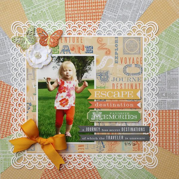
I've been loving the sunburst designs that I've been seeing around the internet lately- I really like how they draw the eye right to the photo. I decided to give it a try and was pleasantly surprised about how simple it was. There are several how-to's for this available in blogland, but I thought I'd share how I did mine.
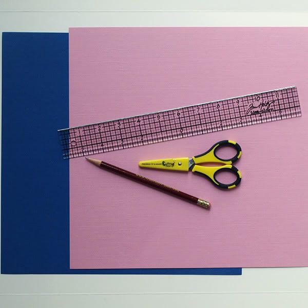
I used 2 full sheets of 12x12 cardstock (the colors don't matter- it'll all be covered up), a straight edge, a pencil, scissors, and of course patterned paper from the kit (paper not shown here).
By the way, sorry about the wonky lighting... natural light in my house is pretty much non-existent.
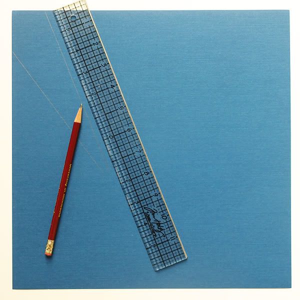
The first step is to make a template. Begin by deciding where the center point of your sunburst will be located. I decided to have my sunburst coming from a bit to the left and a bit below the very center of the page. Once I decided on that, I just began drawing lines using my pencil and ruler from the outside edge of the sheet of cardstock towards the area that I decided that my sunburst would be bursting from. I didn't measure the distance between the lines or anything- I just "eyeballed it". I also didn't take care to draw the lines all the way to the exact burst point, as I knew I'd be covering much of the inner part of the sunburst up with my photo and such. See below...
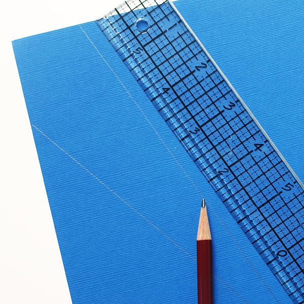
Below is a closer look at my first pair of lines, in case they were hard to see above.
I worked my way around the whole page, drawing a total of 15 lines somewhat evenly spaced apart, going from the outer edge of the sheet of cardstock towards the center point of my sunburst. Next, I numbered the pieces from 1 - 15 so that I would know what order they belong in. Then I cut the 15 pieces, or 15 sections of the sunburst template, out.
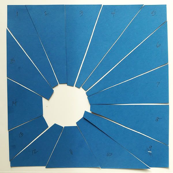
Now that I had my template, all I had to do was trace around each of the 15 sunburst template pieces onto a variety of patterned papers from the kit. I chose 4 different pattern papers that I felt coordinated well with my photo and began tracing. Below is piece number 12.
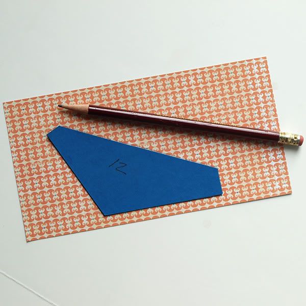
The next step is to cut out the traced sunburst pieces.
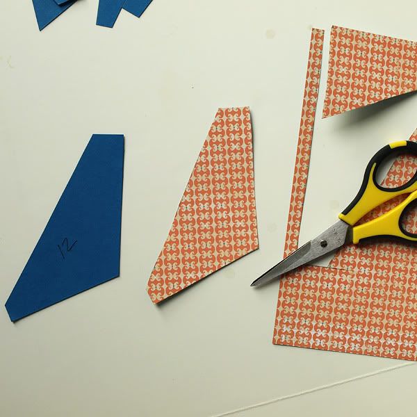
As I cut each piece out, I adhered it to its correct spot on the second sheet of 12x12 cardstock. It didn't matter that my cardstock was pink because it was all going to be covered up with the beautiful papers from the kit. A little tip- I recommend using a liquid glue for this because it gives you a few seconds to slide the sunburst pieces around a bit until you get them exactly where you want them, unlike most dry adhesives which are pretty much stuck the second you lay them down.
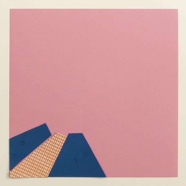
Once all 15 patterned paper sunburst pieces are cut out and adhered, you can layer on top of your sunburst as desired.
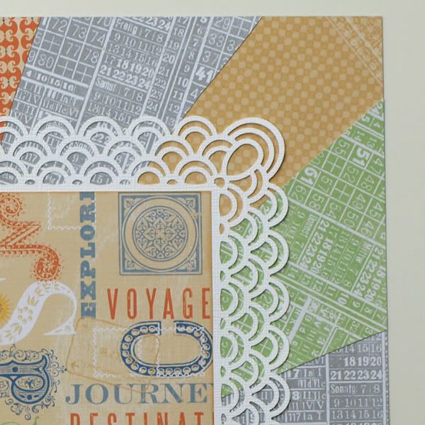
Try it! It is a bit time-consuming, but it's super easy and results in a fun background for your layout!
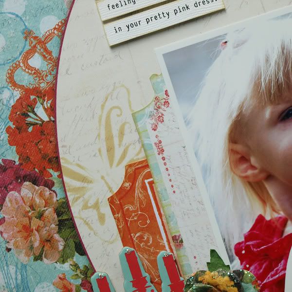
I used a very simple masking technique on the layout below and thought I'd share how I did it.
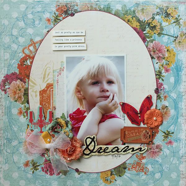
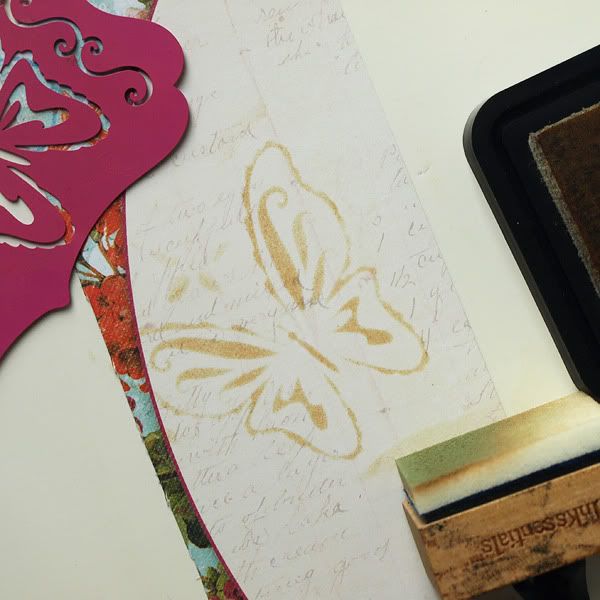
All that's needed is a mask (I used a butterfly stencil), an ink pad, an ink blending tool, and choice of patterned paper.
(note- the paper in this little tutorial is just a scrap- I had forgotten to photograph these steps as I made the actual layout)
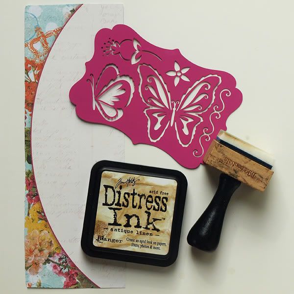
Simply place the mask or stencil in the desired location and apply ink onto the mask. If there are multiple images on your stencil like there are on mine, it helps to cover the other images with tape during the inking process so that you don't accidentally use more of the mask on your layout than you had intended to.
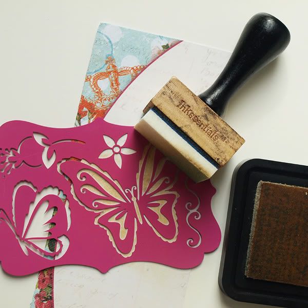
This is the result of running the ink over the stencil.
Just a simple way to layer in some added interest!
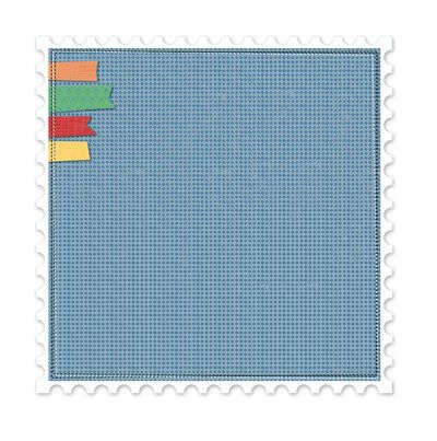
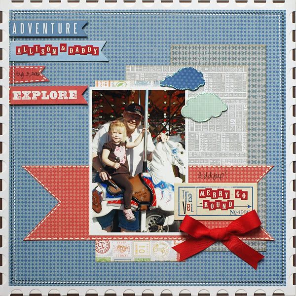
The Creative kit this month includes a super cute decorative edge embossed cardstock sheet with pre-printed pennants in one of the corners. I love the design of this sheet but wanted the pennants to only be red and blue in color instead of the four colors that are there.
That was an easy adjustment- all I did was adhere some blue and red cardstock stickers and chipboard pennants over the pre-printed orange, green, and yellow pennants. This allowed me to keep the original design but change the colors enough to better match the photo.
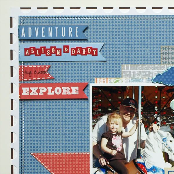
To further coordinate the layout colors with the colors in the photo, I needed to add some brown to go along with my daughter's brown outfit. To achieve this, I simply matted the decorative edge cardstock sheet onto a piece of 11-5/8 x 11-5/8 solid white cardstock, and then matted those onto a piece of 12x12 brown cardstock. The result is the brown dashed edge around the perimeter of the layout.
Have a fantastic weekend!

No comments:
Post a Comment