People often ask me how I do all the layering on my layouts and cards, so I thought I'd give you a peek behind the scenes in my scrap/bedroom and show you all the steps of creating the card as shown above.

I always start with picking a few coordinating papers and lie them in front of me on my desk. I look at them endlessly until I found two or three papers that would go together perfectly as a background for my card.

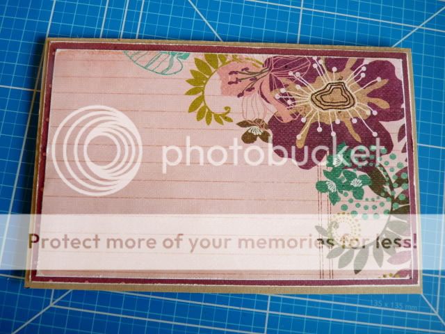
When I have decided which two or three papers I want to use as mats on my card, I start cutting them in the perfect size (my card measures 4x6 inch, so the size of the purple rectangle is about 3,7x5,7 inch. Because you will only see a very small edge of the purple paper, I cut out the inner part, so I can use it to punch out a few butterflies. I used sanding paper to distress the edges of the paper.

I then added the pink layer on top of it.

After creating the base for my card, I start searching for flowers, stickers and other items that would be perfect for embellishing my card. I simply search through my stash for items that have the same colours or the same feel to it as the papers have.

I always have way too much stuff laying around on my desk to put on one card, but I just love it to try a few things and move them around until I'm satisfied. I thought this cluster of birds and the three paper layers behind it looked pretty nice, so I decided to start off creating.

Instead of starting off with the layers behind my embellishments, I worked from top layer to bottom layer on this card by first putting together the embellishment cluster around the sentiment. I fussy cut a few flowers from a sheet of paper and attached them to a Tattered Angels frame.

To give both the frame and the flowers a shimmery feel, I lightly sprayed on them with perfect pearl mist.

After that I attached the two Prima birds and the sentiment sticker to the frame. Because the sentiment 'loyal' didn't really fit the occasion I wanted to use this card for, I used alphabet stickers to create my own text and added these to the sticker.

Next I started creating a bow to put next to the frame. I simply made two bows for a more elegant and rich look.

Then I started adding the paper layers and tags to my card. As you can see I decided, during the process of creating, that I preferred the yellowish brown paper instead of the blue paper that I started with. That's the reason I never stick everything down immediately: in that way I am still able to change things up. I also added a small piece of the ribbon that I made the bow with to my card. To make sure its edges wouldn't ruffle, I added a bit of tacky glue to the ends of the ribbon. This will dry clearly and quickly, so you won't see I used glue when the card is all finished.

I attached the bow to my card and then started further embellishing my card with a couple of the many embellishments I have laying around on my desk. I choose to use a resin heart, pearls, rhinestones and two punched butterflies.

To further decorate my card I used some of my favourite mixed media: glossy accents, liquid pearls, stickles and crackle accents.

This is what the card looked like after I decorated it. I randomly added a few dots of pink liquid pearls and decorated it with glitter and gloss.

Before calling my card 'all finished' I took another close look at it and noticed 'something was missing'. After pondering a while, I found out what I needed and added a small piece of purple paper behind the right bird, so it would stand out a bit more.

And this is what the card looked like when it's all finished.
I hope you enjoyed this tutorial. Thanks for looking and have a great day!
Hugs,
Romy

3 comments:
Romy, this is just gorgeous! Beautiful work!!
That is so pretty!
Romy...just love seeing your thought process behind making your cards! They are always so beautiful!! xx
Post a Comment