 Prima Prize pkg for August challenge, come join the fun to win!
One thing that I really love to do is use scrapbook packaging on my layouts. It makes me feel good to find beauty and re-use something that is normally thrown away. I use packaging from ribbon, embellishments, flowers and even paper (the front cardboard on paper pads) on my layouts. It doesn't bother me that there are company logos, names, descriptions or bar codes. In fact, I think that adds a certain charm to a project. So many companies are now making pretty packaging and encouraging people to go green and re-use the packaging. Prima and K&Company, for example, have been doing this for some time. Some other companies that I like to use packaging from are Pink Paislee, BoBunny and Basic Grey.
This challenge starts right now and will end on September 14 at midnight. Please post your entry both in the contest gallery and in on the message board thread, so it can be easily found back for the Design Team when they send in their votes.
Your entry has to be new as of today to be entered in the challenge. The winner will be announced just a couple of days after the challenge has come to an end.
Pam has generously offered another wonderful prize for the winner so get started on your entries! I am excited to see your creative ways to scrapbooking packaging on your layouts
Here are some samples of recent work that use scrapbooking packaging on my layouts.
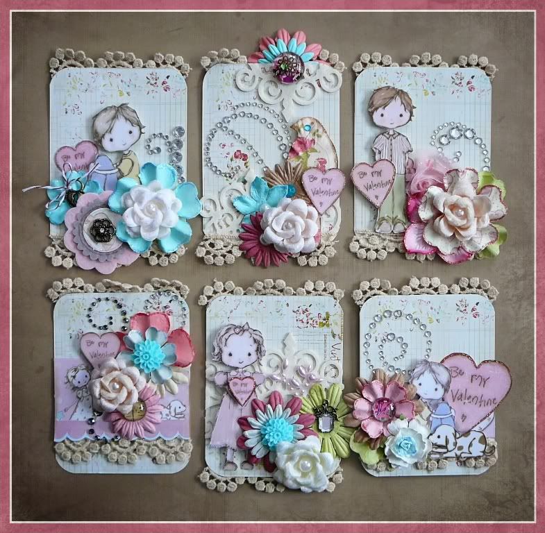
This is a set of ATC's that I made for Valentines Day and all 6 of them are made with Prima Marketing packaging as the base of the ATC.
Resized to 88% (was 781 x 768) - Click image to enlarge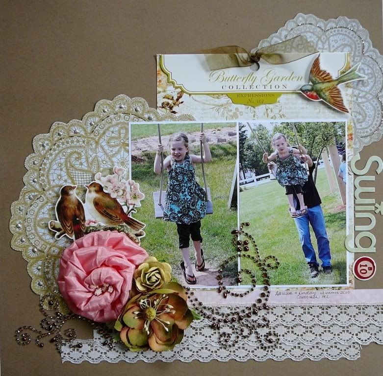

I used Pink Paislee packaging behind the photos as a layer, attaching ribbon bows to the holes that are meant to hang product up with.
Resized to 94% (was 733 x 550) - Click image to enlarge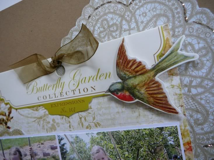

Resized to 90% (was 770 x 768) - Click image to enlarge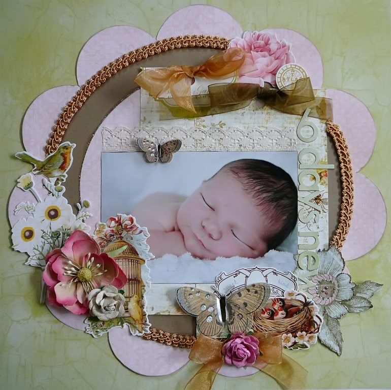

I used packaging from two Pink Paislee products as a layer behind my photo and again, attached ribbon bows in the holes.
Resized to 94% (was 733 x 550) - Click image to enlarge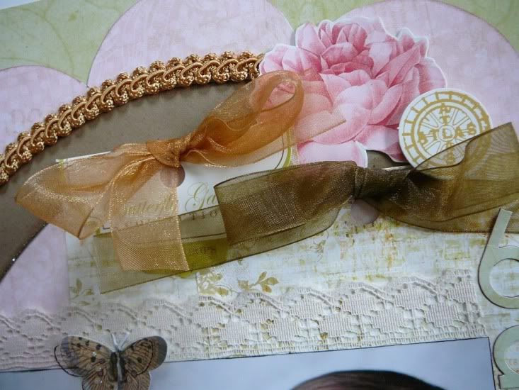

Resized to 90% (was 768 x 785) - Click image to enlarge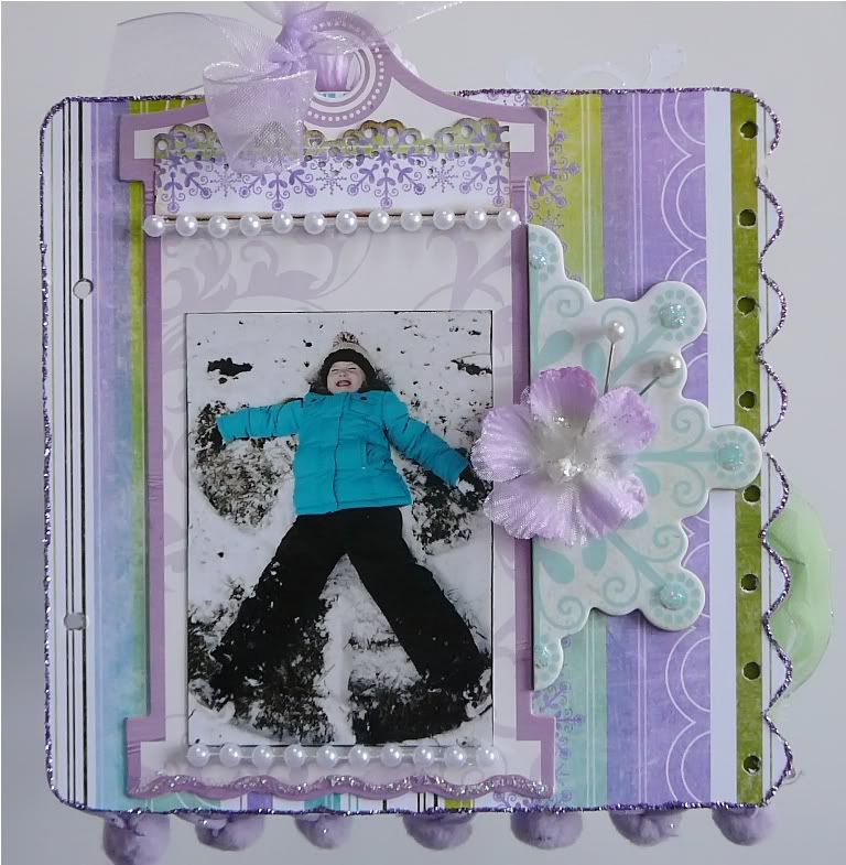

BoBunny flower packaging is used here to matte a small photo, with embellishments added to the front.
Resized to 87% (was 791 x 800) - Click image to enlarge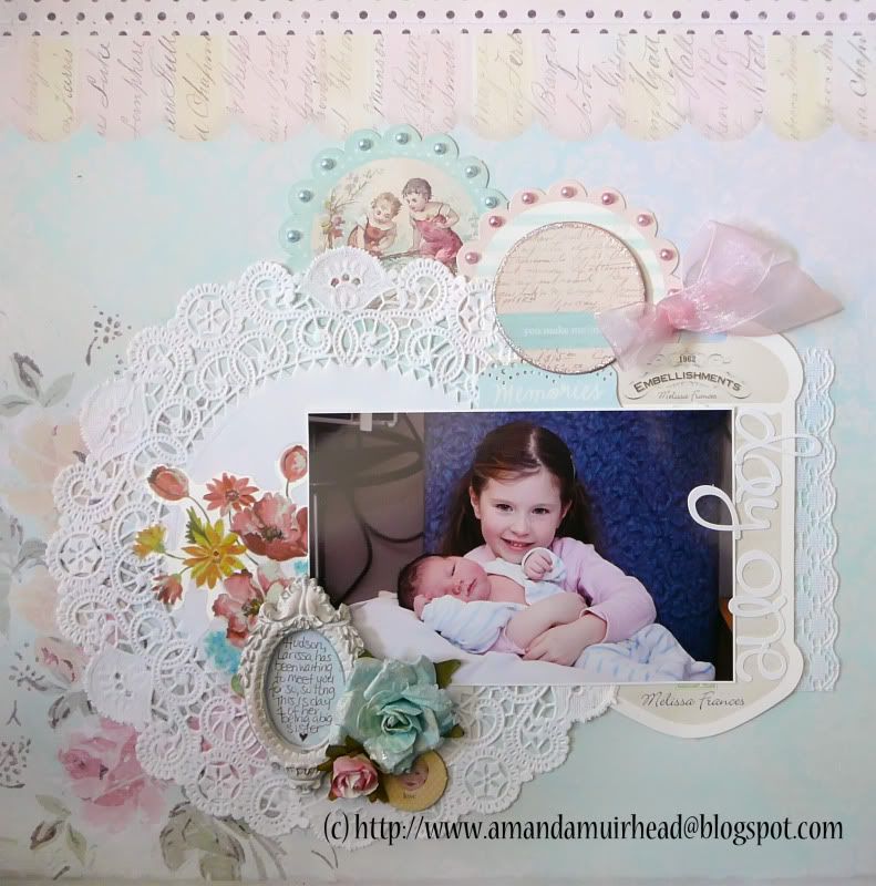

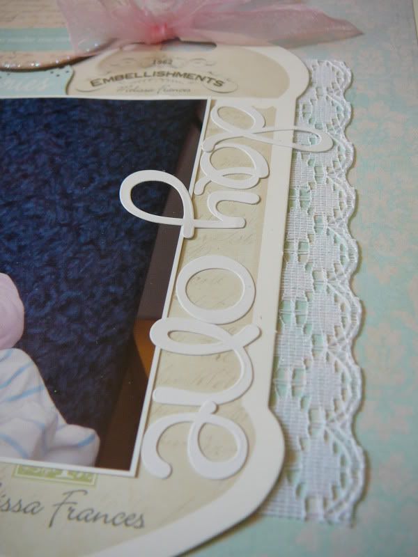
Melissa Frances packaging is used here to frame the side of my photo and a title and ribbon is added to it.
Amanda

5 comments:
Gorgeous projects and what a cool idea! I have all the original packages I am just going to have to pick one and try this!
Just found your blog and I am giving you a blog award. Come and get it at my blog http://thingsandstuffbynicole.blogspot.com/2011/08/i-won-liebster-blog-award.html
I've used packaging on my pages before like the chipboard from cereal boxes, but never thought of using it this way. What a great idea!
Gosh Amanda, each project is gorgeous, but those little ATC's are just adorable!!!!
Excellent challenge!! I may have to try to join in on this one!
Post a Comment