Girls each month our Design Team provides a How did I do that showing tips and techniques that they used to created their layouts. Here is Alicia's post for June showing us how color changes the look of your page...Thanks Alicia!
Such great tutorials so far! Loved reading them.
I admit that one of my most difficult "chores" when I design a page is trying to decide what color cardstock/background to base my page on. I want to show you in this tutorial the different looks the "color" cardstock can make to your page.
On this page, I had the overall design completely finished, laid out, and mostly glued down on my Basic Grey magnetic mat, but I wasn't sure which color cardstock (or patterned paper) background I wanted to use, so I grabbed a few and just started playing around, trying to decide what "look" I wanted to achieve.
I'll put you inside my head now. I really thought I wanted something bold yellow so the blues in the patterned paper would pop, so I tried this:
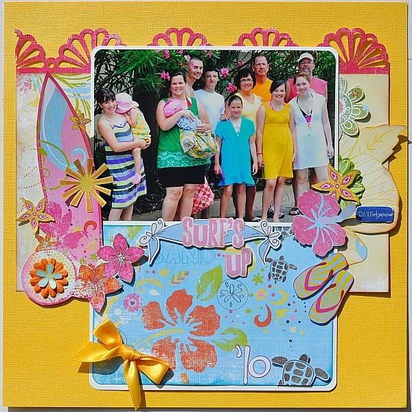

 I hated this!
So, now I tried a more neutral, softer pastel color:
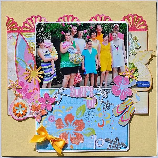
BORING!
Okay...let's try the blue dotted patterned paper from the kit:
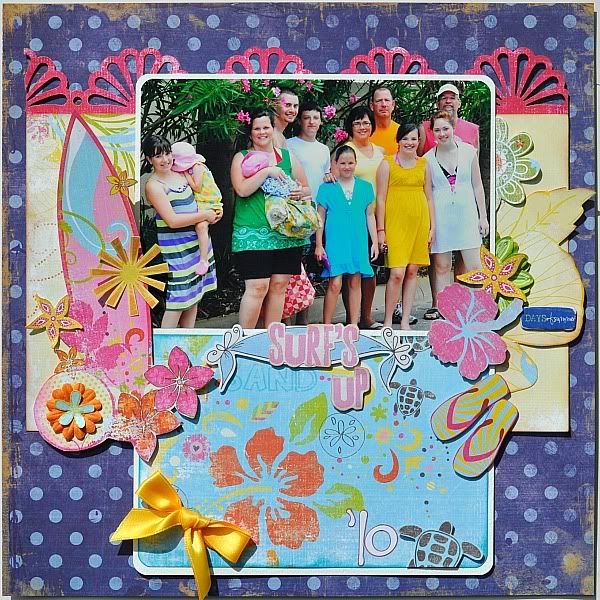
Not crazy at all about this because the blues didn't match real well and the big dots distracted from my pretty page. Not this one!
Let's try a Bo Bunny subtle pink-dotted background:
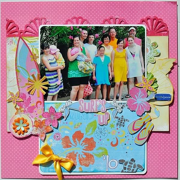
This was okay...but it just didn't grab me because my darker pink fans at the top did not show up real well.
Kraft is always one of my go-to-colors, especially with beach colors:
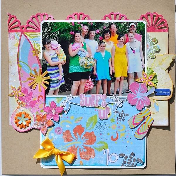
This looked way to drab to me, and usually, I love kraft. Now what?
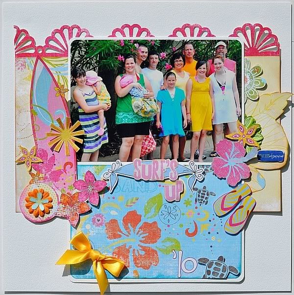
Yep...when all else fails, try white-colored cardstock because you can always add a little glimmer mist to pizazz it up, but it still looked so blah to me.
Then....I went with this brighter blue:
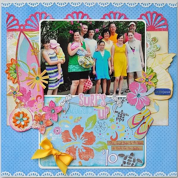
I was in love! However, I still think I needed to break up the bold blue a little so I added the two white punched trims to the top and bottom! Now, I like the results.
See how a simple change in cardstocks can change a whole page? Play around with cardstock and backgrounds and see what you can come up with!
Such great tutorials so far! Loved reading them.
I admit that one of my most difficult "chores" when I design a page is trying to decide what color cardstock/background to base my page on. I want to show you in this tutorial the different looks the "color" cardstock can make to your page.
On this page, I had the overall design completely finished, laid out, and mostly glued down on my Basic Grey magnetic mat, but I wasn't sure which color cardstock (or patterned paper) background I wanted to use, so I grabbed a few and just started playing around, trying to decide what "look" I wanted to achieve.
I'll put you inside my head now. I really thought I wanted something bold yellow so the blues in the patterned paper would pop, so I tried this:

So, now I tried a more neutral, softer pastel color:

BORING!
Okay...let's try the blue dotted patterned paper from the kit:

Not crazy at all about this because the blues didn't match real well and the big dots distracted from my pretty page. Not this one!
Let's try a Bo Bunny subtle pink-dotted background:

This was okay...but it just didn't grab me because my darker pink fans at the top did not show up real well.
Kraft is always one of my go-to-colors, especially with beach colors:

This looked way to drab to me, and usually, I love kraft. Now what?

Yep...when all else fails, try white-colored cardstock because you can always add a little glimmer mist to pizazz it up, but it still looked so blah to me.
Then....I went with this brighter blue:

I was in love! However, I still think I needed to break up the bold blue a little so I added the two white punched trims to the top and bottom! Now, I like the results.
See how a simple change in cardstocks can change a whole page? Play around with cardstock and backgrounds and see what you can come up with!

1 comment:
Alicia, thank you for showing us the different takes of background. WOW what a difference...It was really a teaching moment for me...thank you.
Post a Comment